I’ve attended a short course with Professor Janez Demsar about how to use Orange. Orange is a visual tool (though it can be used as a standard Python library) to explore data and build predictive models. The intention was to make it easier to perform data-related activities for people without programming background, specially in academia.
However, it’s a pretty nice tool for general use and I’ll show how to do some basic exploratory data analysis and how to build some predictive models. The data I’m going to use is from a Kaggle competition about loan and it can be downloaded in the competition’s page. The idea is to be able to generate an output compatible with the expected by Kaggle.
Consider that I’m very new to this tool so I may not be using it in the best way possible. You can download the Orange file generated by this tutorial here.
Overview
EDA
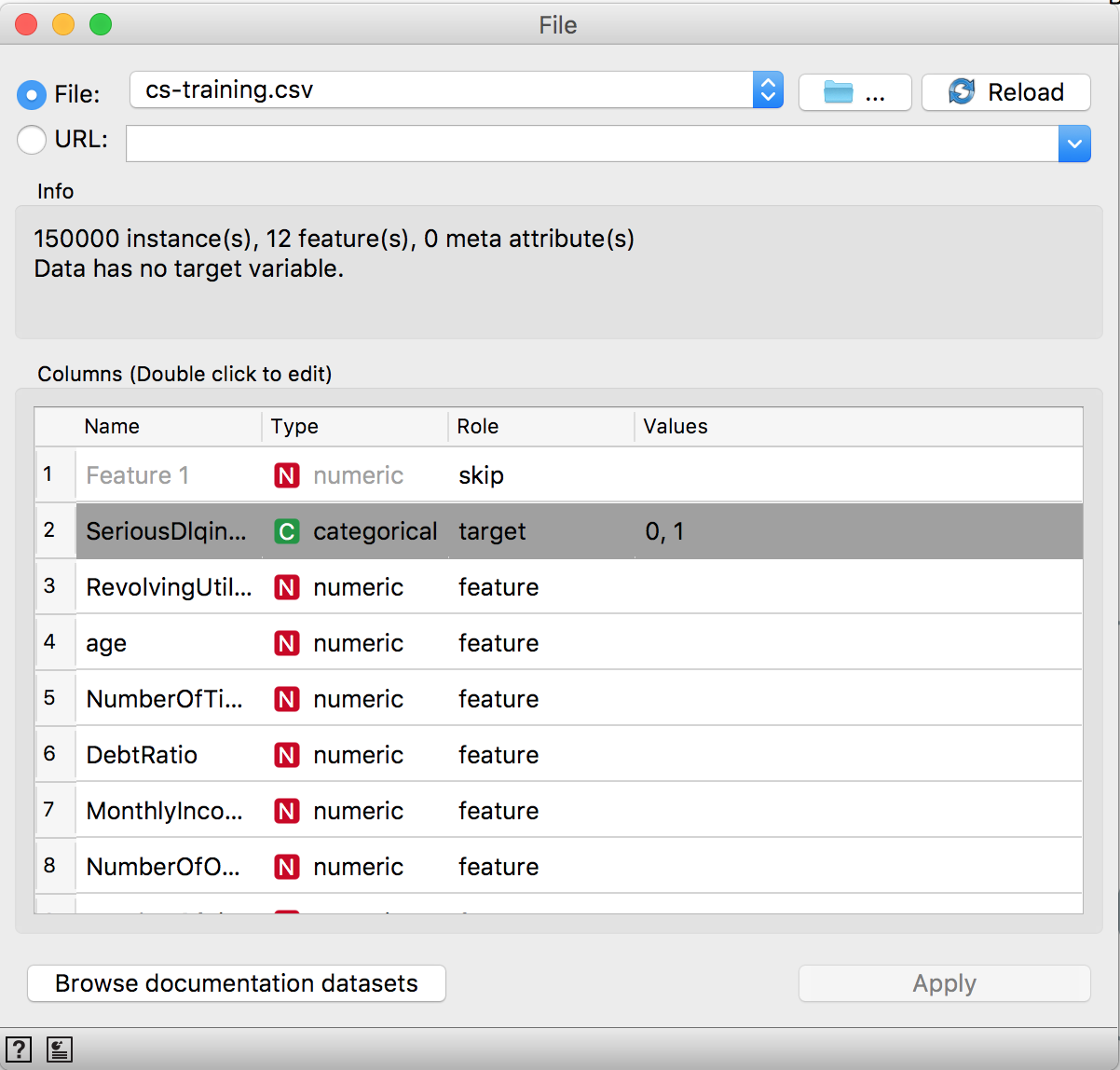
After downloading the data, get Orange. Then open it. First of all, let’s load the data. For that, use the file widget and browse for the cs-training.csv file. Orange use a different extension to data called tab. The tab contains more information about the data than a regular csv, but you can use a csv and then add some information about the column types and which column is the target in a supervised task.
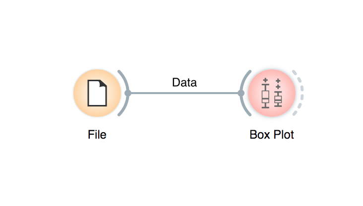
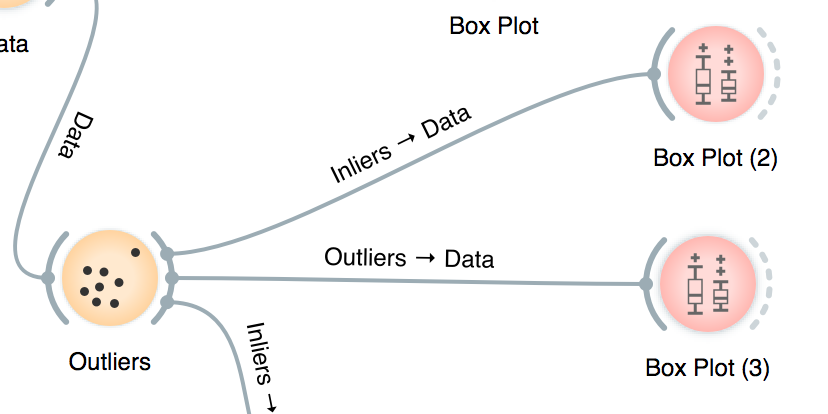
Now we’re going to explore it briefly, because we are more interested in the predictive models. A sensitive aspect of the data for our purpose is its distribution. We can check for outliers using the box plot. Click on the file icon, it’s going to create a link, then place it in a white space and release it, it’s going to prompt with possible widgets, type Box Plot. It’s possible to check data distribution and even splited by some categorical variable in the dataset.
It’s easy to observe that many features in this dataset suffer with outliers. As a first example, look at the MonthlyIncome:
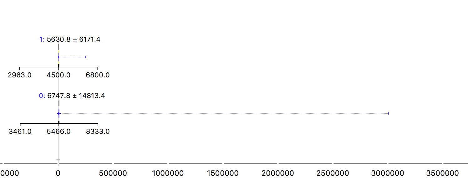
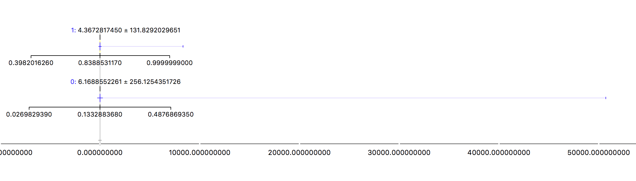
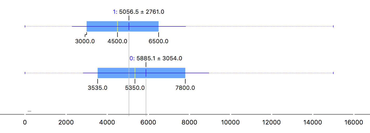
The two rows are for the 0 and 1 values for the target. Being the 1 people that defaulted. It’s a strange plot, right? Yes, but due to the outlier! The maximum value is so bigger than the mean that it spoil our beautiful blox plot. While the mean is around 5-6k, the maximum value is more than 3 million. That can be very harmful for the model and it makes it impossible to use the mean to describe this feature. Another example is the revolving (when a customer does not pay what they own and start to pay interest over the amount):
Ok, time to act over it.
Preprocessing
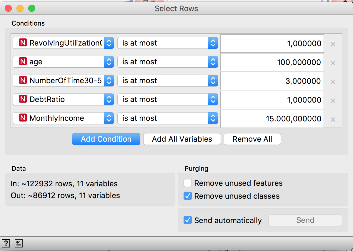
So it’s needed to treat the outliers. There’s a widget for that and it’s going to be used to filter the outliers:
Even so, the distributions still very skewed. So the Select Rows will be used to filter extreme values for each feature:
And now the distribution looks better:
Now it’s time to missing data imputation. The average is going to be used to replace the missing values (without the outliers, it’s not a problem to use it), but the median would be a good alternative.
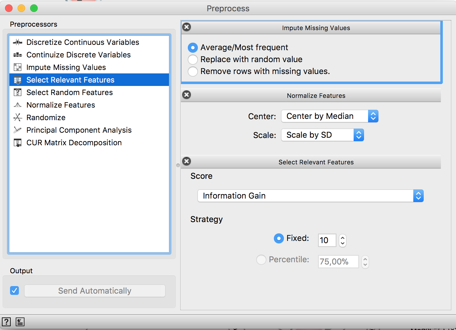
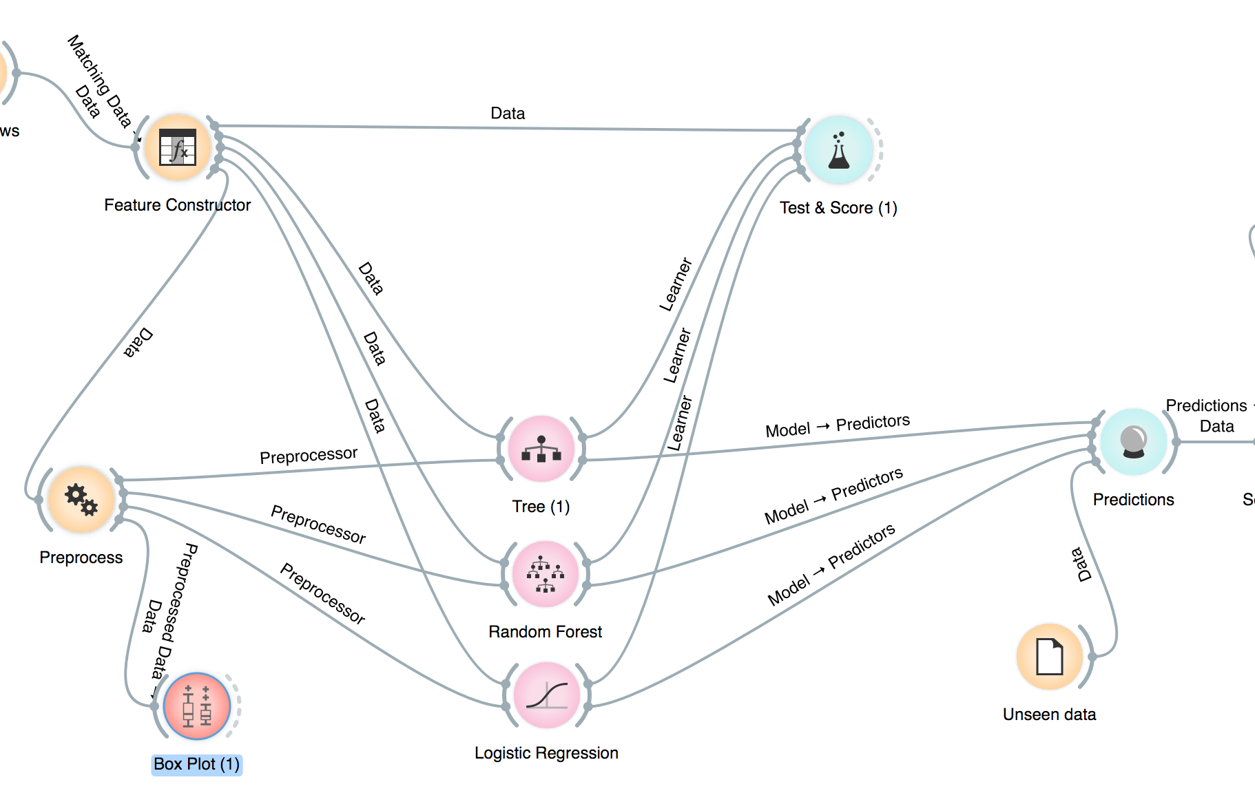
Two kind of models will be tested: a linear one (logistic regression) and a tree-based one (RandomForest). Since the first one requires scale change, both of them will receive scaled features. Also, a feature selection step can be performed and the maximum number of features can be selected, e.g. if you want your model to use at the most 10 features and use a criteria to select the 10 most important ones. Everything is done by the Preprocessing widget.
Feature Engineering
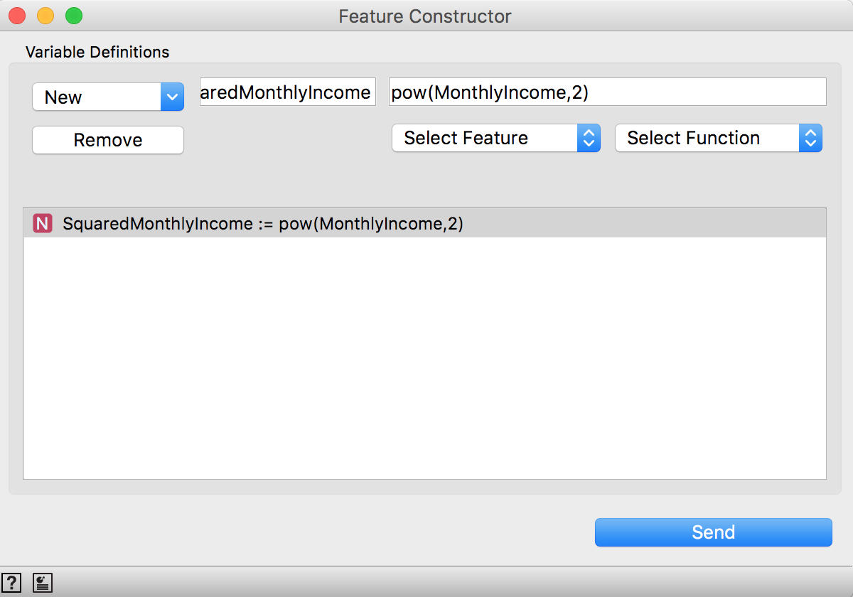
Here’s just a demonstration on how to do it. So the only feature engineered will be the SquaredMonthlyIncome. It can be done using the widget Feature Constructor. The features and a list of functions can be used to generate new ones:
If you don’t want to include it or test the performance without it, you can use the Select Columns.
Training Models
It’s possible to test a nice range of models. Here the models used are Decision Tree, Random Forest and Logistic Regression. You can visualize
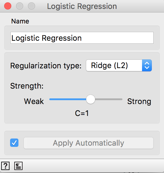
The widgets allow to control the model complexity. In the Logistic Regression you can use both Lasso (L1) and Ridge (L2) and choose the parameter magnitude.
In the Decision Tree and Random Forest their parameters like tree depth and minimum number of samples in a leaf can be set.
Another cool thing is to visualize the model. For that, use the widget Tree viewer:
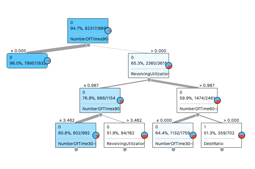
As it can be seen, the top features to split well our target are NumberOfTimes90 (the number of times the the customer was late in the last 90 days) and the RevolvingUtilization.
The Logistic Regression weights can also be seen. Just grab a link from its widget and connect to the Data Table widget. It’ll display the coefficients by default:
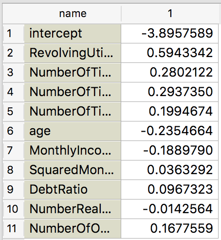
And it makes a lot of sense. The more obvious features to contribute to default have indeed positive weights, like all the NumberOfTimes... features and RevolvingUtilization!
But it’s needed to validate all these models and it’s super easy! Using the widget Test & Score it’s possible to choose the validation schema and check all the models performances accordingly to some metrics:
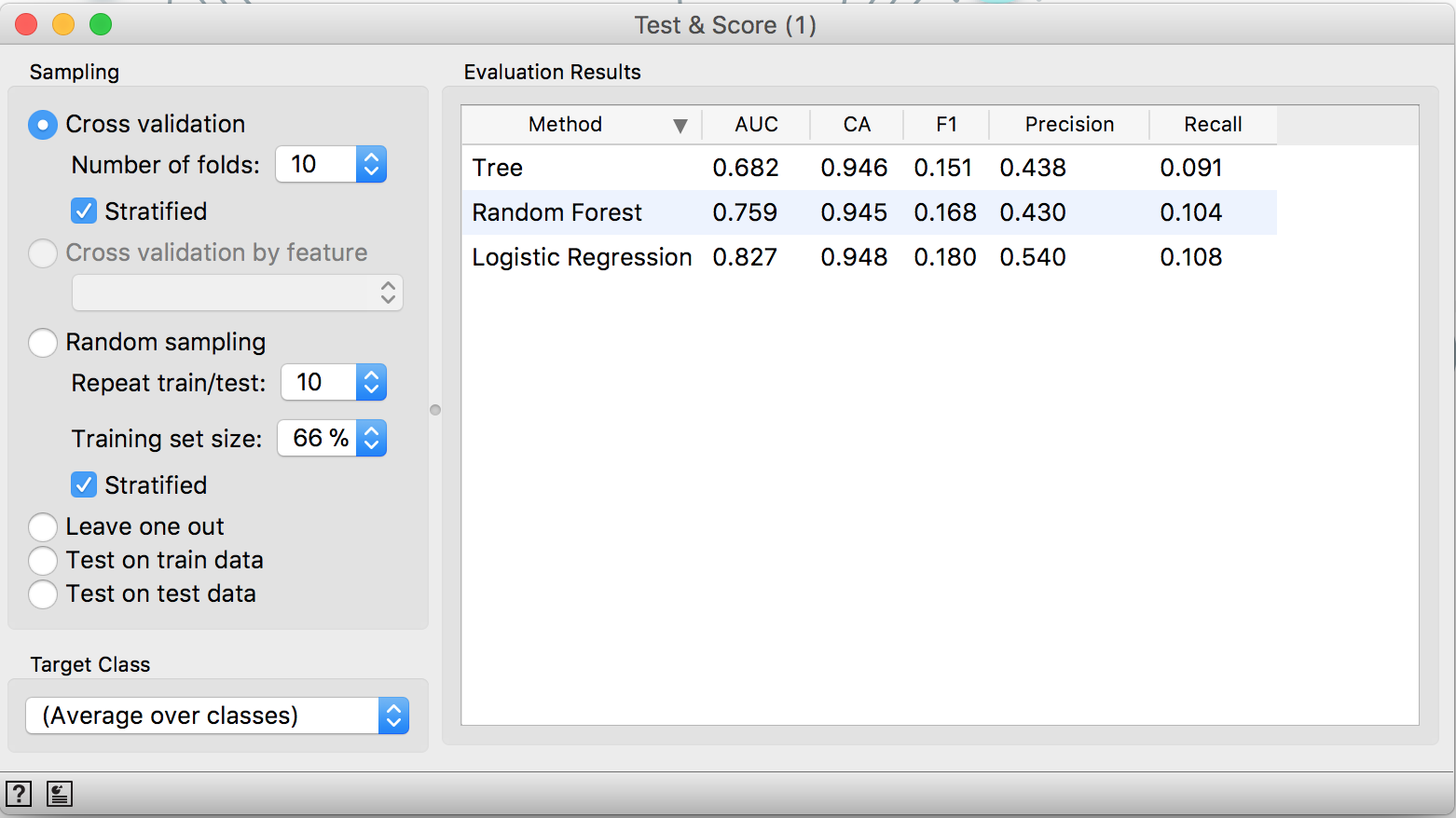
As it can be seen, using a 10-fold cross validation, the Logistic Regression achieves a 0.82 AUC and it’s the best model tested in the present task considering this metric. You can also do it in a way cleaner way if you pass the “Feature constructor” and the “Preprocessor” directly to the “Test & Score” and just connect the widget from the models you want to try.
Making Predictions
The unseen data need to pass through the same pipeline that the training data. And that’s why the models receive the preprocessing method so they are a composed function. So we feed the Predictions widget with the trained models and the unseen data and it generates predictions for all models and all classes!
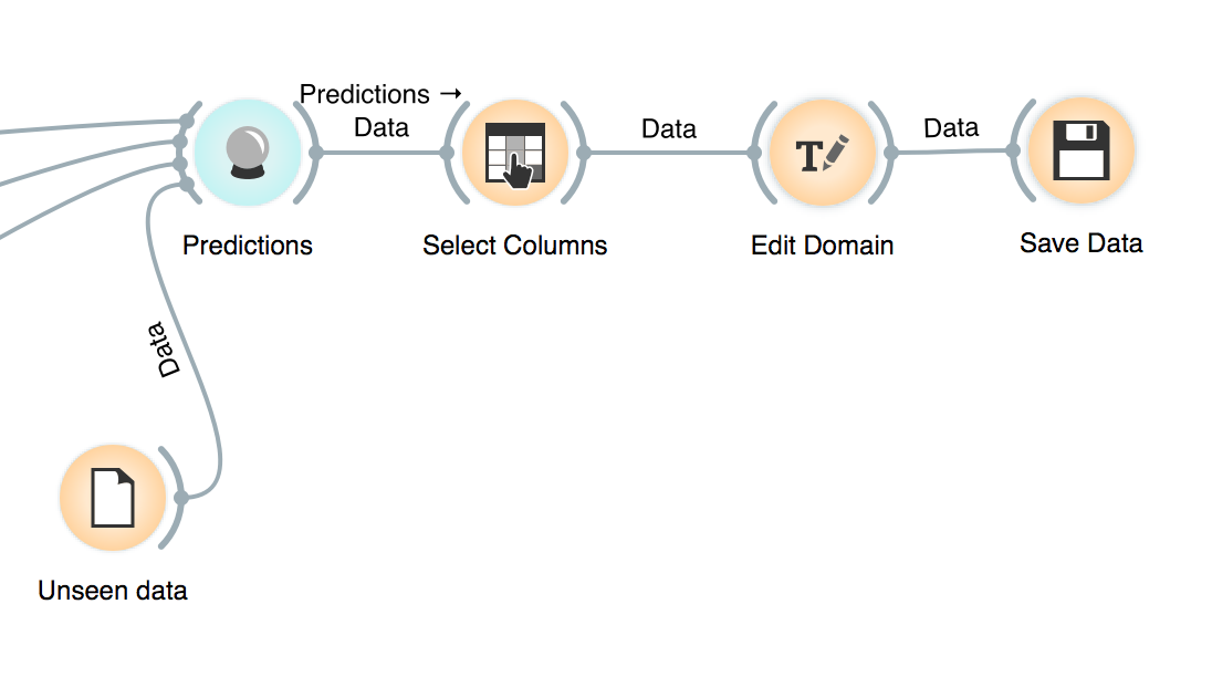
After it, we select the predictions we are interested in (probably only the positive case and the best model) and export it.
To be able to submit to Kaggle I had to make some manual manipulations: excluded the type of data (the two rows after column names) and converted the column “Id” to int.
import pandas as pd

data = pd.read_csv("submission.csv")
sub = pd.read_csv("sampleEntry.csv")

sub["Probability"] = data["Probability"]

sub.to_csv("sub.csv", index = False)
Wrap Up
Using Orange it was possible to easily perform exploratory data analysis, outliers treatment, data cleaning, feature engineering, feature selection, validation, model selection, model interpretation and predicting for unseen data. An entire predictive model building made really simple.